Do Horizontal Lines Make a Good Symbol for a Button?
Recently, a friend of mine asked me what I thought of the “horizontal lines” symbol that is being used more and more frequently to indicate where to click or tap to get to a navigation menu. I really had to take some time to think about it, because I realized I don’t usually pay very close attention to the symbols used on buttons in the apps that I use.
I spent a couple of days paying attention to what’s on my buttons, and I noticed the horizontal lines in all sorts of places. I also noticed that, although the symbol was most commonly used to represent access to a menu, horizontal lines are used represented a number of different functions. This was in contrast to the other common symbols I saw in use, which overwhelmingly represent the same thing across the board. One important caveat to all of this is that I only observed symbols in the apps that I normally use, which means I only saw apps on iOS between my iPhone and iPad.
Below are six examples of where I’ve seen the horizontal lines symbol used. I took a 64×64 snapshot of each, and I’m showing them here at double their original size. Without the context surrounding each one, can you tell what they are for?
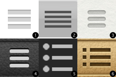
Let’s take a closer look at them, each in its original context (all of the following images are shown at half size, because retina displays make things huge).
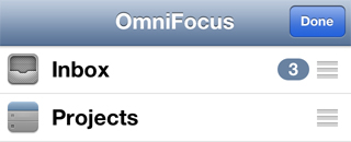
Item number one is from OmniFocus (shown here on my iPhone), the app that I use for my to-do list. Now that we can see the horizontal bars in context, we can see that they are used here to represent the iOS action of sorting a list. This usage has been around since the earliest days of iOS. It’s used in native iOS apps as well as third party ones, and doesn’t require the developer to create any custom graphics. In this context, the lines could represent the items in the list that you are reordering. I’ve also heard it suggested that this usage is skeuomorphism. The three horizontal bars could be meant to appear as a rough surface where you finger can gain traction so that, instead of scrolling through the list, you actually move the list item up or down.
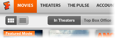
The second image is from the Fandango app on my iPad. When shown in context, it’s fairly easy to see that this control allows the user to select between a thumbnail view (left, currently selected) and a list view (right) of the available movies. In this case, the symbols used on each button are a visual representation of what the rest of the view will look like when that option is selected. The controls’ location at the top of the screen also helps to indicate that they affect the main view.
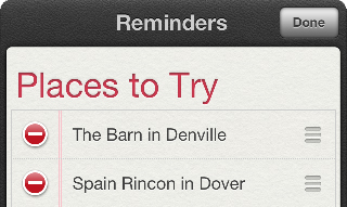
Item number three is from Apple’s Reminders app. This is a list of restaurants I started, so that I remember new places I want to eat at. I always think of them as I pass them on the road, but forget about them when I’m actually hungry. The usage of the horizontal bars in this case is the same as what we saw in OmniFocus. When you go into edit mode, you can rearrange the items on your list of reminders. Notice, in this case, that Apple has provided a custom appearance for the symbol. I’m pretty sure the one in OmniFocus is just the standard one that is built into iOS.
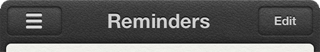
Image number four is also from the Reminders app. This is very interesting, because now we have a direct conflict of meaning. Tapping on the horizontal bars in this context isn’t how you access the functionality of rearranging your reminders, you have to tap the Edit button for that. In this context, the three horizontal bars bring up a menu, a list of the different reminders lists you have created. This may include lists associated with different accounts, such as iCloud or an Exchange account.

The fifth image is from the app Blogsy, which I use to write most of my posts for the site. Surprise! It’s our old friend the bulleted list. This is quite possibly the original usage of this symbol. Although you could argue that the bullet point dots next to the bars make it a different symbol, I’ve seen the two used interchangeably in different contexts.

The final image is from the Find My Friends app. Like I mentioned above, the horizontal bars symbol with or without the bullet point dots is used interchangeably by many apps. In Find My Friends, this button brings up the list of people who have shared their location with you. The inclusion of the bullet point dots here is most likely because the list shows each person’s contact image to the left of the details. Much like the Fandango app, the symbol used on this button is a visual representation of the data it lets you access.
These are only six of the many places where I saw the horizontal bars symbol used. Remember, I was only paying close attention for a couple of days, and also only really looking at iOS apps on an iPhone or iPad. Even with this limited sampling, it’s easy to see that the horizontal bars symbol is heavily dependent on context to convey its meaning. I noticed many other symbols with common meanings, but the functions those symbols represented were much more consistent than what I’ve seen with these horizontal bars.
The conclusion that I drew from this exercise is that we have to be careful what symbols we put on our buttons. It’s not always enough to think about what visual representation makes sense for the function we attach to it. We also have to consider if that symbol, or similar symbols, are commonly used to represent other functions, and if the surrounding context will be enough to help the users infer our intent.

About Adam Platt
Adam Platt is a technologist with more than a decade of experience across the full stack. His passion for technology and penchant for rendering complex technical ideas into simple terms have made him an in-demand speaker. His resume includes BriForum, the PowerShell Summit, teaching engagements and more.
He is one of the 10 types of people who understand binary and he can solve a Rubik’s Cube.