Thoughts on the Windows 8 Consumer Preview
Contents
So I’ve had the opportunity to play with the recently released Windows 8 Consumer Preview, and I wanted to write down some of my thoughts to see if others who have experienced the new look and feel of Windows have felt the same way. In general, it’s been a very positive experience.
Before I get into the details, I just want to note that if you’re a Mac user, don’t bother trying to get VMWare Fusion to run the Consumer Preview (as of the time of writing this, anyway). I was able to get it up and running quickly and without any problems using VirtualBox. Getting a widescreen resolution to work took a little tinkering, but I found the instructions here. Don’t worry about the part where it tells you to go to Program Files, the VBoxManage command you need should be available (and in scope) from the Terminal app. The syntax and parameters are all the same.
Notable Features
Metro
The Metro style was first introduced on Windows Phone 7, and was later brought to the XBOX 360. It is crisp and modern, with broad swatches of flat colors and simple fonts that make for a very clean feeling experience. Live Tiles, one of the stars of Metro, are squares or rectangles that occupy the grid which makes up the home screen. They are “live” because they can dynamically update with new data. For example, the Live Tile for mail may update with a number to reflect how many new e-mails you have. This is Microsoft’s answer to the Notification Center added to iOS 5. My friend Greg over at DataBoost observed the other day that in Windows Phone 7, the home screen is your notification center.
In the Windows 8 Consumer Preview, Metro appears as a layer of the experience. I wouldn’t say it is on top of the traditional “desktop” (which you can still access), but perhaps next to it.
Start Screen
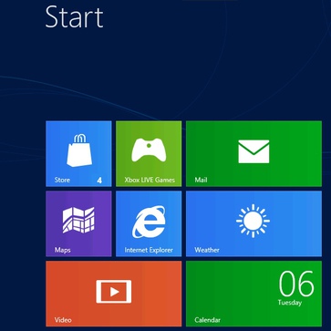
The Start screen consists of a series of Live Tiles that you can use to launch various apps. One of the “apps” is the regular desktop that we are used to from Windows 7. Some of the other notable apps are Mail, Messages, Contacts, and Calendar. Microsoft, as it began doing with Windows Live Essentials, has split its functionality out by task. In my experience, when things are split up this way, it’s easy to find what you need based on what you’re trying to do.
Fullscreen Apps
Metro styled apps all run fullscreen. Tapping on the Mail Live Tile, for example, causes it to flip over and expand to fill the entire screen momentarily as the app loads. In a few cases this was a little jarring, as the entire screen is lit up with the bright color of the Live Tile. Once the app is done loading, though, your eyes get a break. Microsoft has done a great job with these preview apps. While there is still a long way to go to make them really efficient and useful, this is still just a preview and there is plenty of time to make it happen.
Apps having an entire screen to work with isn’t overwhelming due to the amount of space the Metro theme adds to the mix. This is undoubtedly also to ensure things are large enough for fingers to tap on, but things can feel a bit sparse at times. I found myself wishing, even if just a little bit, that more mail messages would fit on the screen at once.
App Snapping
If you have a widescreen resolution, you also have the ability to have two Metro apps on screen at the same time. If you “grab” an app at the top of the screen and then drag it over to one side, a vertical bar appears, indicating that “dropping” the app there will dock it on the side. I was able to have Mail open, with Messages on the left or right side of the screen.
While this is pretty cool, you can also tell that app developers are going to have to do a little extra work to tell Windows how to display their app when it is docked at the side of the screen. The Evernote app, for example, which I downloaded from the app marketplace, is useless when docked. You just see the left-hand edge of the normal view, and all the text gets cut off. There must be an event or something for developers to hook into in order to customize the app interface while docked.
Impressions
Drastic Departure
The Windows 8 Consumer Preview gives a glimpse of what Windows will become. Microsoft has been operating in the desktop PC world for many years, and has been ramping up its activity in the mobile world very rapidly recently. Windows 8 looks like it is aiming to be the best of both worlds, leading towards an inevitable “one version to rule them all.” This results in some pretty bold changes from what we are used to on our desktops. No more start button, no more task bar, heck now that I think about it I don’t think I saw a single hourglass or spinning blue circle the entire time I was interacting in the newer Metro styled interfaces (I wasn’t paying attention, it might be there).
The point is that, just how Windows 95 ditched the Program Manager window that held essentially all of your content, leaving the desktop hiding behind it all, Windows 8 is moving towards ditching the desktop itself in favor of a collection of self-sufficient fullscreen apps connected together by the Start Screen, the new root of your Windows experience.
Overall, this big change is a good one. I’m sure Microsoft still has lots of figuring out to do, but again there is still plenty of time for that. If I had one negative thing to say about the Windows 8 Consumer Preview, it would be…
Too Much Touch?
Windows 8 is going to be making a big push into the tablet world. Naturally, this means it’s going to have a lot of touch elements in it, and existing controls that are mouse-centric have to be re-thought so that they are compatible as well. At the same time, using the Windows 8 Consumer Preview feels clumsy, as some of the things you have to do to interact with applications work great as touch gestures, but feel very strange when done with the mouse.
Cornering the Mouse
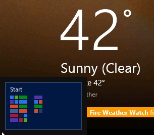
The Start button is gone, and in its place is what I guess you’d call the Start corner. if you bring the mouse to the lower left-hand corner of the screen, a small representation of the Start Screen appears which you can click to return to the start screen. The problem is the way it behaves. When the mini Start Screen appears, my first reaction is to click on it, which means moving the mouse to the center of the image and clicking. When you move the mouse away from the corner, it vanishes, leaving you to click on whatever was underneath it.
The upper left-hand corner of the screen is home to task switching. When you hit the corner, you get a view into the last application you were in before the current one. If you then slide downward, you can see a longer list of the other applications that are waiting for your return. You have to do this in just the right way, though, or the whole thing disappears.
The right-hand corners (both upper and lower) give you access to the “charms” which let you do things like access the current application’s settings or share information between apps.
It’s important to note that none of this involves clicking and dragging, clicking is only used to commit to whichever option you’re hovering over. That means all of the interaction listed above happens purely based on where you move the mouse. This is very different from what PC users are used to, and feels foreign. These corner gestures, which probably equate to “swipe in from the corner” are natural for the finger, but cumbersome at best for the mouse. With no obvious alternatives (although I’m sure there are some snazzy keyboard shortcuts), the average user will have to do extra work just to get by.
“Closing” an App
Closing an app in the Windows 8 Consumer Preview is another strange action. Gone are the three buttons in the upper right-hand corner of a window. The days of minimize, maximize/restore, and close are coming to an end. Instead, closing a Metro app starts at the top of the screen. You have to click and drag from the top (as you would to snap an app to the side of the screen), and drag it all the way to the bottom. The visual cue during the dragging action is that a small version of the app’s view follows the mouse cursor, except it is vertically locked in the center of the screen (so it is only following along the X axis). Once you’ve dragged down far enough, the image becomes vertically locked near the bottom of the screen. Letting go at this point “closes” the app.
Now, if you’ve noticed the quotes I’m using around the word “close,” then you know there’s another point to make. Dragging an app off the bottom of the screen does not actually close it. If you run the Task Manager (you have to go to the Desktop for this), you’ll see that the app is actually still running. It’s just no longer on your list of running Metro apps for fast switching.
A downward swipe is a great feeling gesture for a touch device, and can easily be associated with a thought like “get this out of my way.” The act of dragging a window from the very top to the very bottom of your screen with a mouse, however, feels like moving or relocating the position of an app, not closing it. For screens with higher resolutions, it is also a bit of a chore since you have farther to drag. Moreover, the inconsistent behind-the-scenes behavior is questionable in my mind. Microsoft may have done this to help out its newer, more casual audience, however stalwart Windows users want to know that when they close a program it is really closed.
Finally…
I realize this is a preview, and many things are likely to change in the final release of Windows 8. At the same time, discussing the preview provides the feedback that Microsoft needs to figure out what changes it wants to make, so I don’t feel bad saying that some of the things I saw in the Windows 8 Consumer Preview kind of made me twitch.
Also, I want to stress again that my overall impression of the Windows 8 Consumer Preview is positive. I’m pretty impressed with the clean design and smooth flow of much of the OS, as well as the way it still seems to “just work” for the most part. Once you get to the Desktop, you’re essentially at a Windows 7 computer, and if you’ve upgraded to the preview from an existing machine you can still access all of your existing applications.
Since the introduction of Windows Phone 7, I’ve seen Microsoft making some huge leaps in the way they approach their platform. This type of polish formerly only came through in their development products like Visual Studio and Blend (there’s some kind of irony in there, I think). With the strides that Microsoft has made over the past year or two, I think Windows 8 has a lot of good things in store, and I can’t wait to see it in its finalized form.
